
Creating a Stunning Website Design
When embarking on the journey of creating a website, the first step is to clearly define its purpose. You must…
When embarking on the journey of creating a website, the first step is to clearly define its purpose. You must ask yourself what you aim to achieve with your online presence. Is it to showcase your portfolio, sell products, or provide information about your services?
Understanding the core objective of your website will guide every decision you make, from design choices to content creation. A well-defined purpose not only helps you stay focused but also ensures that your audience understands what you offer at a glance. Moreover, recognising your target audience is crucial in this process.
You should consider who will be visiting your site and what they are looking for. Are they potential customers, clients, or perhaps fellow professionals? Tailoring your website to meet the needs and expectations of your audience will enhance user engagement and satisfaction.
By aligning your website’s purpose with the interests of your visitors, you create a more meaningful experience that encourages them to explore further and take action.
Summary
- The purpose of your website should be clearly defined and reflected in its design and content.
- Choose a colour palette and fonts that align with your brand and evoke the right emotions in your audience.
- High-quality images and graphics can enhance the visual appeal of your website and engage visitors.
- A user-friendly navigation system is essential for guiding visitors through your website and improving their experience.
- Incorporating responsive design ensures that your website is accessible and functional across various mobile devices.
Choosing the Right Colour Palette and Fonts
Colour Palette: Evoking Emotions and Influencing Behaviour
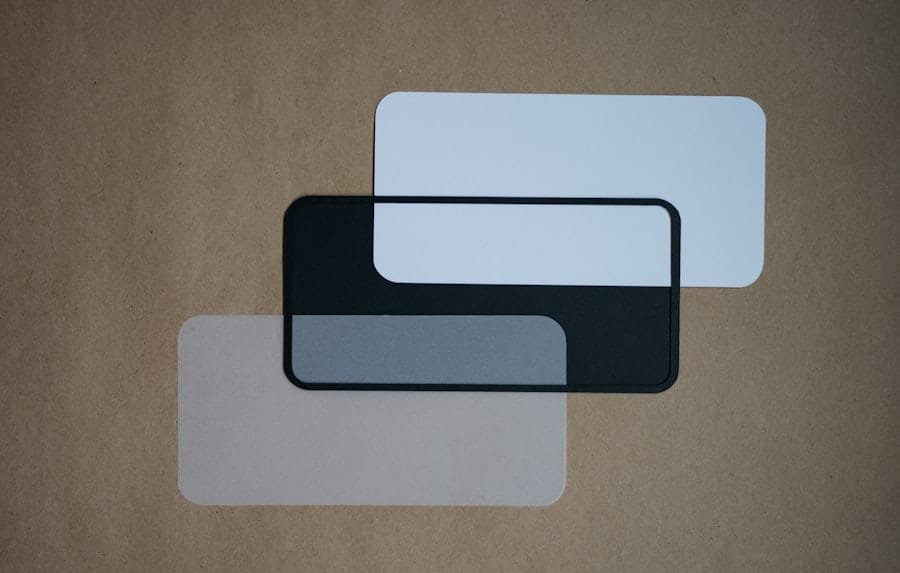
The visual elements of your website play a significant role in how visitors perceive your brand. Selecting an appropriate colour palette is essential, as colours evoke emotions and can influence user behaviour. You should choose colours that reflect your brand identity while also considering the psychological impact they may have on your audience. For instance, blue often conveys trust and professionalism, while red can evoke excitement and urgency.
Striking a Balance: Aesthetics and Functionality
Striking the right balance between aesthetics and functionality will help create a cohesive look that resonates with your visitors. In addition to colour, the choice of fonts is equally important. Typography can significantly affect readability and user experience.
Typography: Readability and Visual Appeal
You should opt for fonts that are not only visually appealing but also easy to read across various devices. A combination of a bold header font and a clean body font can create a pleasing contrast that guides the reader’s eye through your content. Remember to maintain consistency in font usage throughout your site to reinforce your brand identity and ensure a seamless experience for your users.
Utilising High-Quality Images and Graphics

Images and graphics are powerful tools that can enhance the overall appeal of your website. High-quality visuals can capture attention, convey messages more effectively, and create an emotional connection with your audience. When selecting images, you should ensure they are relevant to your content and align with your brand’s message.
Avoid using generic stock photos; instead, consider investing in custom photography or illustrations that reflect your unique identity. Furthermore, optimising images for web use is crucial for maintaining fast loading times. Large image files can slow down your site, leading to a poor user experience and potentially higher bounce rates.
You should compress images without sacrificing quality and use appropriate file formats to ensure quick loading times. By combining high-quality visuals with optimisation techniques, you create an engaging and efficient browsing experience that keeps visitors coming back for more.
Creating a User-Friendly Navigation System
| Metrics | Data |
|---|---|
| Page Load Time | 2.5 seconds |
| Number of Clicks to Reach Key Pages | 3 |
| Drop-off Rate | 15% |
| Mobile Responsiveness | Yes |
A well-structured navigation system is vital for guiding users through your website. You want to ensure that visitors can easily find the information they seek without feeling overwhelmed or confused. A clear and intuitive navigation menu should be prominently displayed, allowing users to access different sections of your site with ease.
Consider using descriptive labels for menu items that accurately reflect the content they lead to, as this will help users understand what to expect. In addition to a straightforward menu, incorporating a search function can further enhance usability. This feature allows users to quickly locate specific information without having to sift through multiple pages.
You should also consider implementing breadcrumb navigation, which provides users with a visual trail of their journey through your site. By prioritising user-friendly navigation, you create a seamless experience that encourages exploration and keeps visitors engaged.
Incorporating Responsive Design for Mobile Devices
In today’s digital landscape, having a responsive design is no longer optional; it is essential. With an increasing number of users accessing websites via mobile devices, you must ensure that your site looks and functions well on various screen sizes. Responsive design allows your website to adapt seamlessly to different devices, providing an optimal viewing experience regardless of whether users are on a smartphone, tablet, or desktop computer.
To achieve this, you should employ flexible layouts and scalable images that adjust according to the screen size. Additionally, consider touch-friendly elements such as larger buttons and easily accessible menus for mobile users. Testing your website on multiple devices will help you identify any issues and ensure that all visitors have a positive experience.
By prioritising responsive design, you demonstrate a commitment to user satisfaction and accessibility.
Balancing Content and White Space
Creating an effective website involves more than just filling it with content; it requires a careful balance between text and white space. White space, or negative space, refers to the areas of your website that are left unmarked or empty. This space is crucial for enhancing readability and guiding the user’s eye through the content.
By strategically incorporating white space, you can create a clean and organised layout that makes it easier for visitors to digest information. You should avoid cluttering your pages with excessive text or images, as this can overwhelm users and detract from the overall message you wish to convey. Instead, focus on presenting information in bite-sized chunks, using headings, bullet points, and short paragraphs to break up text.
This approach not only improves readability but also encourages users to engage with your content more effectively. Striking the right balance between content and white space will result in a visually appealing website that invites exploration.
Implementing Call-to-Actions and Contact Forms
To drive user engagement and conversions on your website, incorporating clear call-to-actions (CTAs) is essential. CTAs guide visitors towards taking specific actions, whether it’s signing up for a newsletter, making a purchase, or contacting you for more information. You should place CTAs strategically throughout your site, ensuring they stand out visually while still fitting within the overall design aesthetic.
In addition to CTAs, including contact forms is vital for facilitating communication with your audience. A well-designed contact form allows users to reach out easily without having to navigate away from your site. You should keep forms simple by only requesting essential information to avoid overwhelming users.
By making it easy for visitors to connect with you, you foster trust and encourage them to take the next step in their journey with your brand.
Testing and Refining Your Design for Optimal Performance
Once you have implemented all these elements into your website design, the final step is testing and refining for optimal performance. You should regularly assess how well your site functions across different devices and browsers to identify any issues that may hinder user experience.
Feedback from real users is also invaluable in this process. Consider conducting usability tests or surveys to gather insights on how visitors interact with your site. This information can guide you in making necessary adjustments to enhance functionality and aesthetics further.
In conclusion, creating an effective website involves a multifaceted approach that encompasses understanding its purpose, choosing appropriate design elements, ensuring usability across devices, and continuously refining based on user feedback. By prioritising these aspects, you can build a website that not only attracts visitors but also engages them meaningfully, ultimately driving success for your online presence.
If you are looking to improve your website design, you may also be interested in learning how to generate SEO leads from LinkedIn. This article from The Digital Projects provides valuable insights on leveraging LinkedIn for SEO purposes. Additionally, for startups in Dublin, understanding SEO is crucial for online success. Check out this article to learn more about implementing effective SEO strategies. Moreover, if you are a small business looking to enhance your online presence, you may benefit from the Local Enterprise Office Trading Online Vouchers. Find out more about this opportunity in this article.


